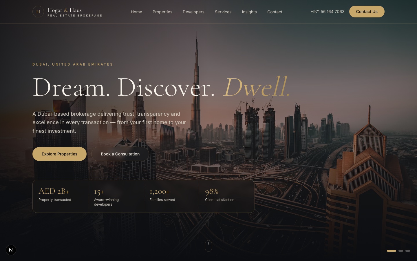
Context
Dubai real estate marketing is crowded and mostly interchangeable: the same listing grids, the same stock skyline. Hogar & Haus wanted a site that read as a premium brokerage from the first screen, under the line "Dream. Discover. Dwell." The brief was as much about register as about features, and that is where the design work went.
What I built
A real application, not a template
The site is a Next.js 16 application with the design system expressed as Tailwind v4 theme tokens in globals.css: colour, type scale and spacing live in one place, so the brand can evolve without hunting through components. It is the same modern baseline I use on the larger platform work in this portfolio, applied to a marketing site.
Typography with a point of view
Cormorant Garamond for display against Inter for body. The serif carries the luxury register; the grotesque keeps property details, prices and forms crisp and legible. That pairing is a deliberate move away from the default SaaS look and towards the print language of high-end property marketing.
Motion that belongs to the brand
Framer Motion drives the hero transitions and scroll reveals. The motion is tuned to feel unhurried and expensive rather than busy: fewer, slower, better-timed movements, with reduced-motion preferences respected.
Decisions worth noting
- Tokens first. Putting the brand into theme tokens before building a single section meant every later component inherited the register for free, and the client's inevitable colour and type adjustments took minutes.
- Restraint in motion. It would have been easy to animate everything. The premium feel comes from what does not move.
Why it is in the portfolio
My career started in graphic design, and this project shows that sensibility translating directly into shipped front-end work on a current stack, for a real client in the UAE market. It sits alongside RTS Store and the Wingman prototype as evidence that the design half of the CTO-as-a-Service offer is real, not a bullet point.