Context
RTS Store positions itself around courage, confidence, authenticity and purpose: "More Than Products. A Statement of Identity." The founders had a full brand brief but had not chosen a visual world for it. Rather than argue in the abstract, I built the brand twice, end to end, so the decision could be made by looking at two finished sites side by side.
What I built
The brand system, shared by both versions
Seven product categories (Fragrances, Apparel, Active, Headwear, Accessories, Journals, Limited), a set of named signature products including the fragrance line FEARLESS, AUTHORITY, LEGACY and PRESENCE, and a membership tier, RTS Black. Taglines, category structure, product naming and the membership proposition are identical across the two executions, which is what makes the comparison fair.
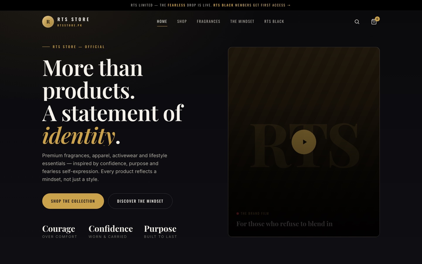
Version one: Bold Editorial Dark
Cinematic black with gold accents, large type, high contrast. It reads as a luxury fragrance house: dramatic, night-time, exclusive.
Version two: Light Editorial
Warm ivory, ink and bronze, set like a magazine. Same products, same copy, but the register shifts towards considered, daytime, lifestyle-publication confidence.
Decisions worth noting
- Decide with artefacts, not adjectives. Two complete builds cost more than two mood boards, but the client could click through real pages on a phone and feel the difference. The choice was made in one meeting.
- System first, skin second. Because the brand system was fixed before either visual direction was built, nothing about the product architecture had to change after the decision. Only the surface did.
Why it is in the portfolio
It shows brand-system thinking, not page templating: translating a founder's brief into categories, product lines, a membership tier and two coherent visual identities, then using the builds themselves as the decision tool. It belongs to the design and branding side of my work rather than the platform side, and it is framed that way.